
Context & Work
KLM Holidays is the package-travel arm of KLM Royal Dutch Airlines, letting users bundle flights with hotels and experiences. The homepage is the primary acquisition surface — yet it underperforms on discovery for undecided travellers.
Problem
The homepage prioritises search over inspiration, losing users who don't yet know where to go.
Goal
Redesign the discovery layer so undecided users find a compelling reason to explore and convert.
Constraints
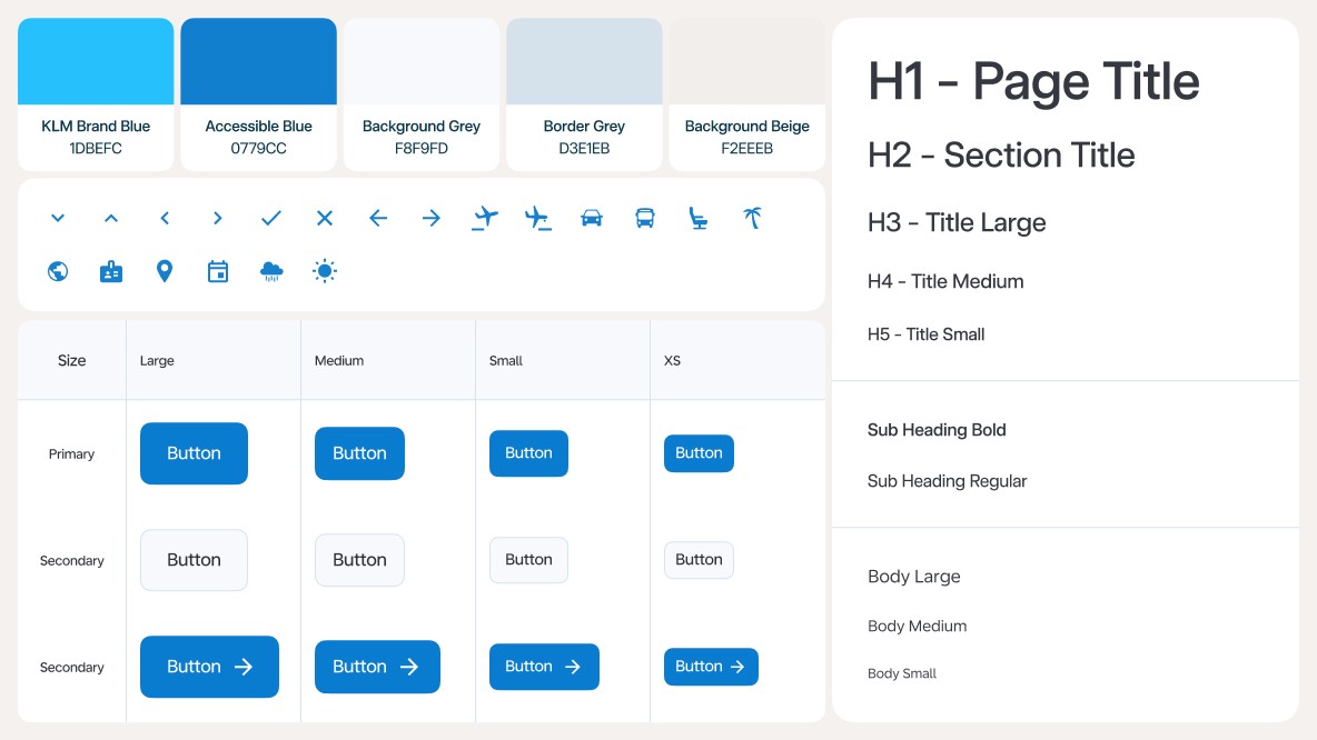
KLM brand system, existing search API, desktop-first with responsive parity.
Heuristic Evaluation
Current homepage audit - Assessed against Nielsen's 10 heuristics, with focus on the discovery experience for undecided users.
Pain points identified
Search-first layout assumes users know their destination — no onboarding for inspiration seekers.
Visual hierarchy dominated by form fields; destination imagery is small and non-interactive.
No progressive disclosure — the full search form is visible and heavy on landing.
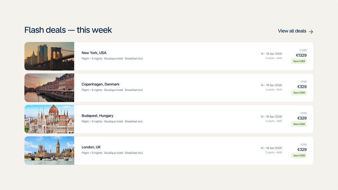
"Deals" content buried below the fold with no ambient signalling that it exists.
Lack of personalisation or contextual cues (seasonality, proximity, popularity).
What works well
Brand trust signals (KLM wordmark, airline colour palette) are clear and reassuring.
Flight + hotel bundling proposition is visible in the search tabs.
Price transparency — search results show total price upfront, no hidden extras.
Navigation is uncluttered and scoped to the task of booking.
User research
Two primary archetypes, two secondary
The redesign is principally built around the tension between the two primary personas. The secondary personas inform feature decisions but do not drive the core structural change.
Design tension:
The current homepage is built for the Decided Booker — it assumes destination intent from the first interaction. The Dream Planner, who makes up the majority of undecided visitors, has no clear path. The redesign resolves this by making discovery the primary entry point without removing the search shortcut for users who already know where they're going.
Primary personas — drive the core redesign decision
Served ✅
🧳
The Decided Booker
Has destination, dates & budget in mind
Goal
Complete the booking quickly, compare prices, trust the platform.
Behaviour
Arrives with intent, uses search immediately, scans for price and flexibility cues.
Current homepage
Well served — search-first layout matches their mental model directly.
Not served ❌
🌍
The Dream Planner
Open to ideas, driven by mood & budget
Goal
Find a destination that feels right — adventurous, warm, affordable.
Behaviour
Browses, needs editorial curation and visual pull to stay on page.
Current homepage
No discovery path — blank search field causes immediate drop-off.
Secondary personas — inform feature decisions
Partially served 🟡
👨👩👧
The Family Organiser
Balancing multiple preferences & budget
Goal
Family-friendly options fast, reassurance on safety and value.
Informs
Family-friendly mood chip, trust strip, inclusions shown on cards.
Partially served 🟡
💼
The Flex Traveller
Chasing deals, dates flexible
Goal
See what's cheapest right now across multiple destinations.
Informs
Inline pricing on cards, flexible dates toggle, flash deals section.
Journey Mapping
Dream Planner — current homepage journey
The undecided user drops off within seconds due to lack of onboarding hooks. Pain points cluster in the first two stages.
1
Lands on page
Referral, social ad, or Google
High cognitive load
2
Sees search bar
Asked for destination immediately
3
Scrolls down
Looking for inspiration
Content feels generic
4
Loses interest
Nothing triggers a spark
Bounces to competitor
5
Ideal state
Finds a deal that excites them
Design rationale 💡
Six key design decisions
Each decision is grounded in a specific UX principle or research finding.
1
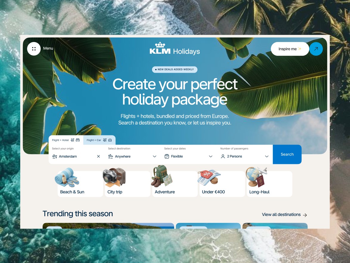
Removes the blank-field anxiety for undecided users. Signals that the platform can guide them — not just take orders.
2
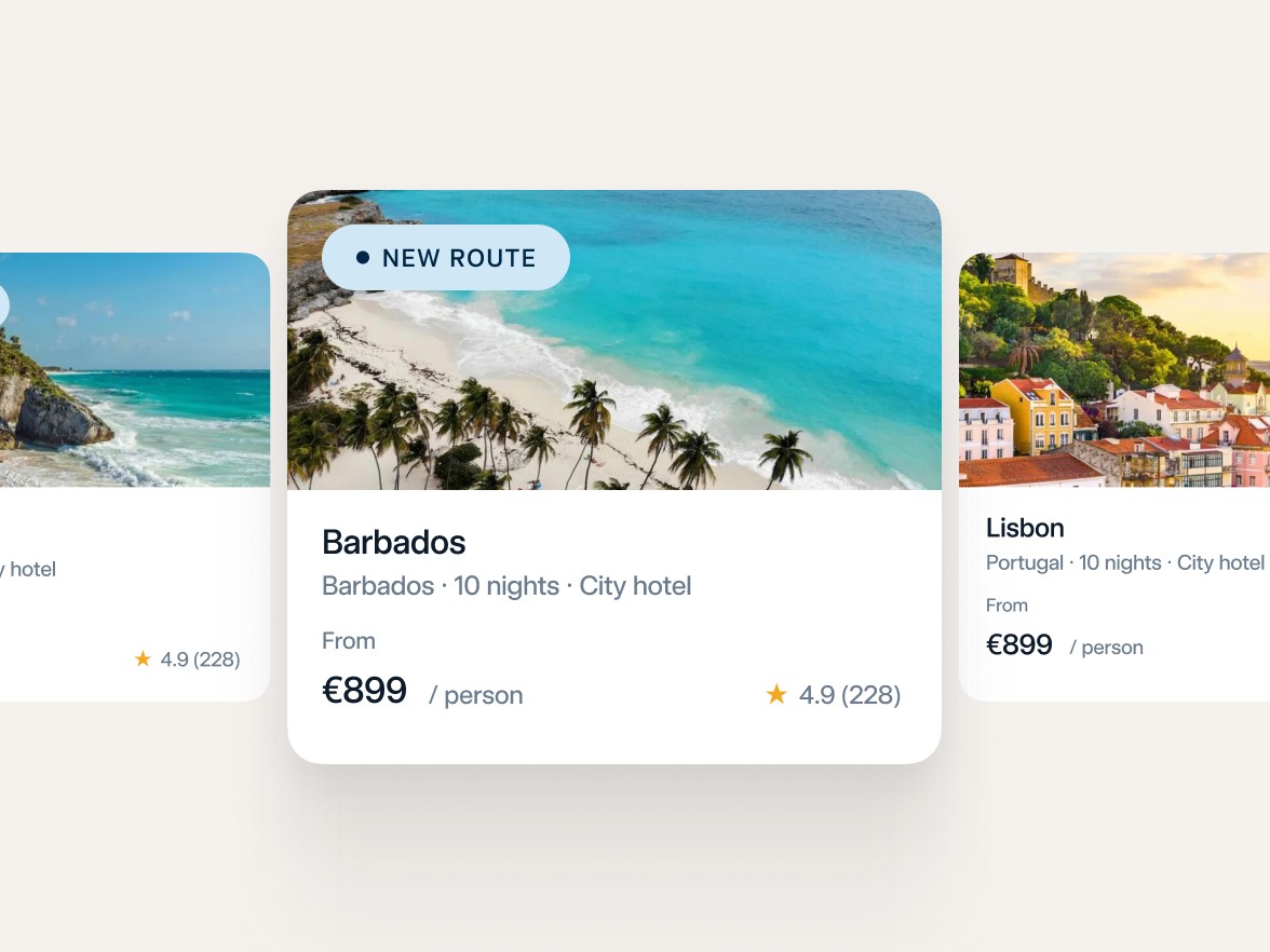
Immediately shows the range of destinations and prices. Provides tangible hooks before users are asked to input anything.
3
Reduces commitment anxiety. Supports the Flex Traveller archetype and increases eligible inventory, reducing no-result dead ends.
4
Shifts perception from utility tool to travel brand. Aspirational visuals increase emotional engagement and dwell time.
5
Provides a declared entry point for Dream Planners. Separates two distinct mental modes: browse vs book.
6
Reduces the steps to valuation. Builds confidence before search commitment. Anchors expectations transparently.
Success metrics 📊
How we'd measure success
Target metrics for an A/B test running over 4 weeks against the current homepage.
38%
▲ target
Search initiation rate
−22%
▼ target
Bounce rate
+2.4×
▲ target
Dwell time on demo
15%
▲ target
Card-to-search funnel